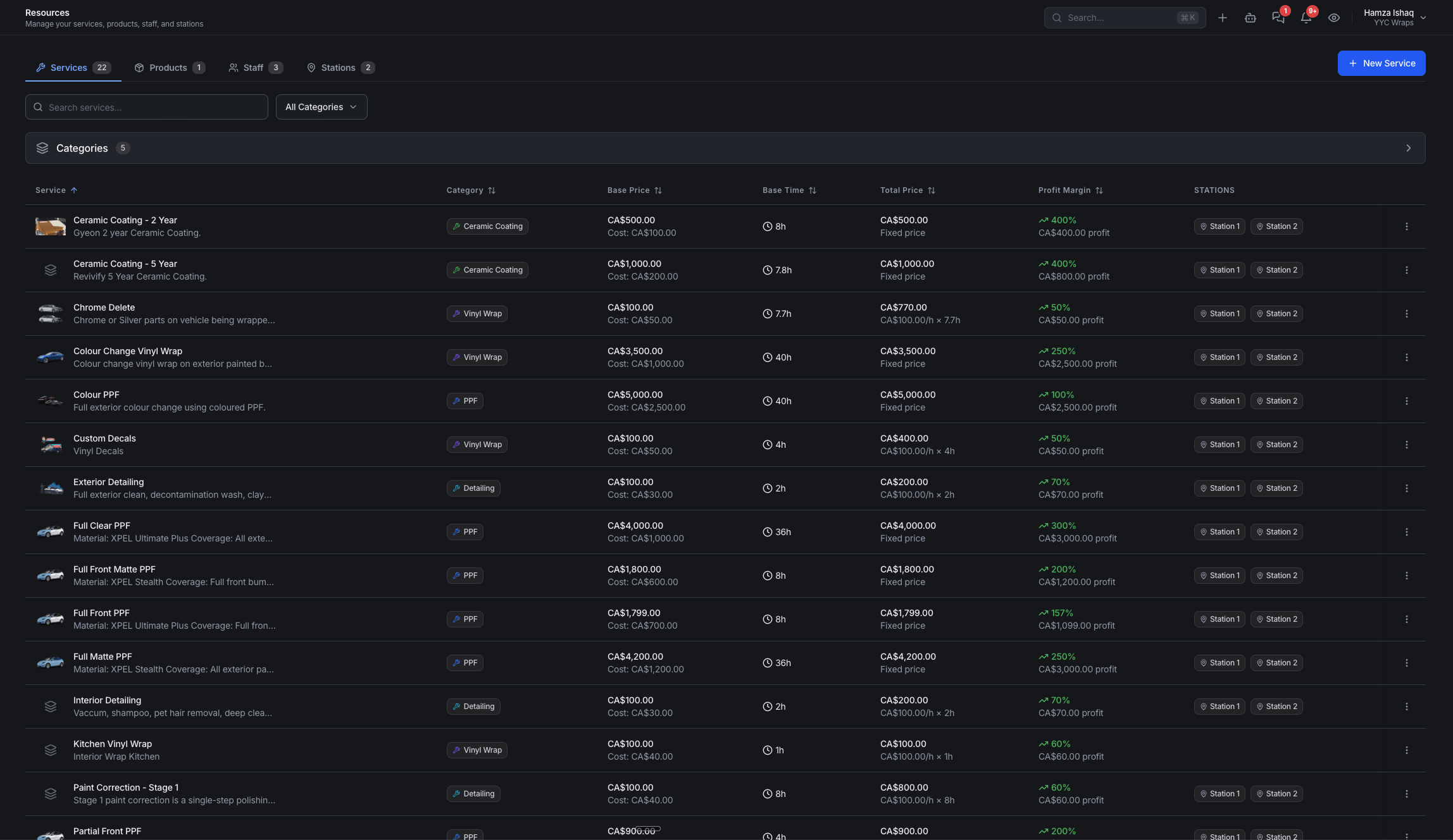
Spend an afternoon shopping for shop software and you'll notice something: they all kind of look alike. Left nav. List view. Filters across the top. Green means done, amber means waiting. Settings behind a gear. Somebody in a Facebook group will inevitably say it out loud — "these are all the same app."
They're not. But they do look alike, and that isn't laziness, theft, or a symptom of AI. It's forty years of design convention doing precisely the job it exists to do: making software you've never opened feel like software you already know.
Why every app converged on the same shapes
There's a principle in user-experience design called Jakob's Law: people spend the overwhelming majority of their time in other software, so they arrive at yours carrying everything they learned there. The X closes the dialog. The magnifying glass searches. The left rail navigates. Blue text is a link. Your customer learned all of that somewhere else, on someone else's dime.
Match those expectations and your software is usable in the first thirty seconds. Break them to look original and you've just charged your customer tuition to use your product.
This predates AI by decades. We still save with a floppy disk that hasn't shipped in a computer since the 2000s. Every spreadsheet on earth is a grid of rows and columns because paper ledgers were, and nobody accuses Excel and Sheets of being the same program. Cars aren't suspicious for all putting the brake in the middle. Convergence isn't a copy — it's an agreement.
Familiarity isn't a lack of imagination. It's the most expensive thing in software to get right.
Look at the software everyone agrees is good
You don't have to take a vendor's word for any of this. Take the products that product people hold up as the reference standard — Linear, Trello and Atlassian's Jira. Different companies, different decades, different jobs. They rhyme anyway. And each one established a convention the rest of the industry now runs on.
Here's what each one actually proved, and where the same decision shows up in Wrapstart.

Linear
Opinionated beats flexibleLinear was founded in 2019 with speed and simplicity as its stated design principles, and the team publishes its reasoning openly as the Linear Method. The line that matters most: flexible software lets everyone invent their own workflows, which eventually creates chaos as teams scale.
So Linear refuses to be everything. It picks a way of working, enforces it, and spends the savings on being fast — keyboard-first, a command bar that the entire industry copied, no infinite configuration to get lost in. Being opinionated is the feature.

Trello
Position is the statusKanban means signboard in Japanese. It was invented by Taiichi Ohno at Toyota in the 1940s to run a factory floor — long before software existed to put it on a screen. Trello started in 2011 at Fog Creek Software and made the factory idea universal: the board is the project, the lists are the stages, the cards are the work, and cards move left to right as they progress.
Nobody reads a board. You glance at it. That's the whole invention — the status isn't a field you look up, it's the column the card is sitting in. Digital walls, cards instead of sticky notes, movement instead of chaos.

Atlassian
Consistency is engineering, not tasteHere's the story that should be taught in every product class. When Atlassian got serious about a design system in 2012, they audited their own products and found 45 different dropdown patterns. Forty-five ways to do one of the simplest things an interface can do — all shipped, all slightly different, all making their customers relearn the same control.
What they built in response is now the Atlassian Design System, and their own engineers describe the payoff precisely: consistent implementation across apps eliminates the learning curve between components. Their principle is sharper still — they avoid consistency for its own sake, and reject infinite flexibility. (They also bought Trello in 2017, which is its own argument about who was right.)
Three reference-grade products. A command bar, a board of cards, a design system. Every one of those patterns has since been adopted by hundreds of other tools, and nobody serious calls it theft — because a convention that survives that much reuse has earned it. That's what convergence looks like from the inside: not copying, but agreement.
The honest version of Wrapstart's position is this. We didn't invent the list view, the board, or the command bar, and we're not going to pretend otherwise. What we did was take forty years of settled convention as the starting line instead of the finish, and spend our actual effort on the thing nobody else built — a system that knows a wrap shop, wired together so the lead you paid for turns into a booked, paid job instead of a message somebody meant to answer.
Consistency is the one rule we don't break
Convention is the agreement between apps. Consistency is the agreement a product makes with itself — and it's the rule we treat as non-negotiable. One pattern for a list. One pattern for a record. One meaning per colour. One place the primary action lives. Learn the leads list and you already know the jobs board, the invoice list, the customer list, the calendar.
That matters more in a shop than it does in an office. Your team isn't a floor of analysts who'll sit through a two-day training. It's an installer with gloves on, a front-desk person mid-conversation, an owner checking one number between appointments, and a new hire every few months. Every novel pattern is a tax, and it's paid by the person with the least time to pay it.
So anything we invent has to survive one question: does this earn the learning curve it costs? Most ideas don't. A screen that borrows a pattern your team already knows ships a hundred times more value than a screen that teaches them a clever new one.
Learn one list, and you've learned all of them
Leads, jobs, quotes, invoices, customers, materials — the same filters, the same row anatomy, the same detail view, the same place to act. New hires get productive the same afternoon because nothing is a special case.
See CRM & Leads →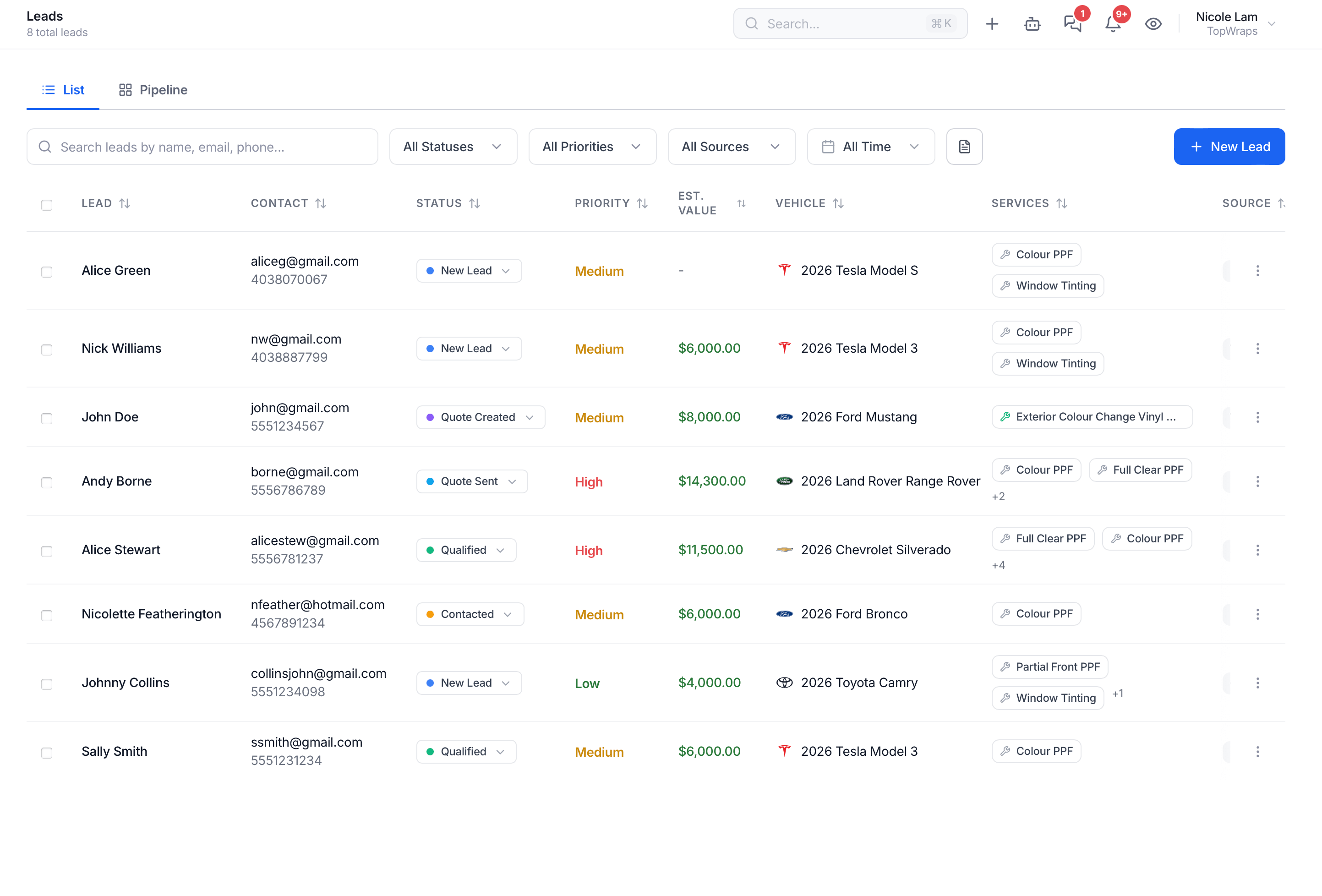
The ten usability heuristics, in shop terms
Jakob Nielsen published ten usability heuristics in 1994. Three decades later they're still the checklist every serious product team measures screens against. Here they are in plain English — and what each one means for the shop actually using the software.
- Visibility of system statusYou should never have to wonder whether something worked. Sent, saved, paid, booked, overdue — the system says so, out loud.In WrapstartEvery lead, quote, job and invoice carries its state on the row, so a glance replaces a phone call.
- Match between the system and the real worldSoftware should speak your language, not the database's. You have leads, quotes, jobs, bays, panels and materials — not "records" and "entities."In WrapstartObjects are named the way shops name them, and the workflow follows how the job actually moves.
- User control and freedomThere's always a way out. Undo, cancel, back out, reschedule — without starting the whole thing over.In WrapstartDrafts persist, changes are reversible, and nothing important is a one-way door.
- Consistency and standardsThe same word means the same thing everywhere, and the same pattern behaves the same way everywhere.In WrapstartThe rule above. One vocabulary, one set of patterns, product-wide.
- Error preventionThe best error message is the one that never has to appear. Design the mistake out instead of scolding people for making it.In WrapstartYou can't double-book a bay, send a quote with no price, or lose a draft by closing a tab.
- Recognition rather than recallDon't make people remember what the software already knows — the last price quoted, the last message sent, the next step owed.In WrapstartThe customer's entire history sits beside the conversation, so nobody works from memory.
- Flexibility and efficiency of useA clear path for the new hire and a shortcut for the veteran — same feature, two speeds.In WrapstartGuided flows for people learning; templates, bulk actions and automations for people who've done it a thousand times.
- Aesthetic and minimalist designEvery element on screen competes with every other one. Restraint isn't decoration; it's how the important thing stays findable.In WrapstartScreens are built around the one decision they exist to support. We cut before we add.
- Help users recognise, diagnose and recover from errorsPlain language: what happened, why, and what to do next. No codes, no blame.In WrapstartFailures name the fix — which field, which permission, which integration — and let you retry in place.
- Help and documentationIt should exist and be searchable — but it can't be the patch for a confusing screen.In WrapstartA real Help Center plus live office hours, written so you rarely need either.
Ten principles for whether it's actually good
Heuristics tell you whether a screen works. Dieter Rams' ten principles of good design — written at Braun for radios and record players, long before anyone shipped software — still tell you whether the thing is any good. They're the filter we hold releases up against.
Innovative
New where new helps — not new for the sake of a screenshot.
Useful
A feature that doesn't move a booked job is decoration.
Aesthetic
You look at this thing all day. It should be calm to be in.
Understandable
The screen explains itself. Good design needs no manual.
Unobtrusive
The tool gets out of the way of the work. It's not the star.
Honest
No promises the software can't keep — in the UI or the marketing.
Long-lasting
Built to still make sense in five years, not to chase a trend.
Thorough to the last detail
Empty states, error states, permissions, the 3-year-old phone in the bay.
Environmentally friendly
Rams meant waste. Ours is your time and attention — the scarcest resource in a shop.
As little design as possible
Less, but better. The hardest one, and the one we fight for hardest.
Looking the same isn't being the same
Here's where the "they're all identical" argument falls apart. Two apps can share a list view and be nothing alike, because the interface is the thinnest part of a product. What separates them is underneath.
Does the lead become the quote become the job become the invoice without anybody retyping a name? Does the AI actually see that customer's history, or is it guessing from the last message? Does taking a deposit update the job, the books and the customer record at once — or in three places, by hand, on a good day?
That's architecture, not decoration. A skin is a weekend. Connected data is years. Wrapstart exists to be the conversion layer for the leads you already paid for, and that only works if every object in the system knows about the others — which is a decision you make in the data model, long before anyone picks a shade of blue.
You can copy a screenshot in a weekend. You can't copy a data model.
So how do you tell craft from slop?
Convention explains why good software rhymes. It doesn't explain the flood of lookalike tools with nothing behind them. The good news: slop is easy to spot once you know where to look — and none of the tells are on the marketing site.
- Pages that don't agree with each other. Different words for the same thing, buttons in different corners, two visual styles in one product. Nobody drew a system; every screen was improvised.
- No empty states. A brand-new account looks broken instead of welcoming. Nobody thought about day one.
- Happy path only. Try to break it — bad card, missing field, no internet. Software with no error states has never met a real user.
- Features that don't talk. The quote doesn't know the customer. The calendar doesn't know the job. The "AI" can't see either.
- Copy that could belong to any industry. If it never says bay, VLT, squeegee, panel or deposit, it wasn't built for you.
- No roles, permissions or audit trail. Real shops have staff, turnover and mistakes. Software that assumes one perfect user has never run a team.
- Nothing outside the demo. No keyboard focus, no loading states, no dark mode, no usable phone layout — the parts nobody screenshots are the parts craft shows up in.
- No humans behind it. No named team, no dated design history, no research, no track record. Just a logo and a waitlist.
What we actually did
Wrapstart wasn't sketched to chase a trend. It came out of four years of dated design files, real user research with real shops, an information architecture mapped long before a single screen was final, and 15+ years of building production software for some of the largest organisations on the continent. The AI sits on top of that foundation — it isn't the foundation.
And the part that can't be cloned: the thesis was proven in a bay before it was software. Same shop, same person, same spend, no new ads and no new leads — 3× conversions, purely from working the leads properly. Every design decision in the product traces back to that: what an owner actually needs to see, in what order, at 7pm with a car on the lift.
Right down to the lights being off
Dark mode isn't a gimmick — it's for the person doing invoices at 11pm and the tablet living under shop lights. Every screen is drawn twice, because "thorough down to the last detail" is a principle, not a slogan.
Take a look inside →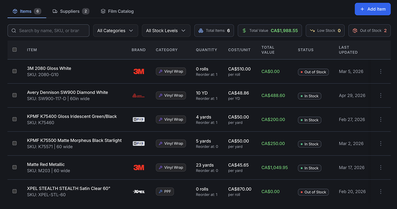
Familiar on the surface. Different underneath.
If Wrapstart feels familiar the first time you open it, good — that was the point. Everything you already know about software should still apply, so you can sit a new hire down and have them working by the afternoon. We're not trying to win an award for reinventing the dropdown.
The difference was never going to be in how the list looks. It's in what happens after you click: whether the lead moves, whether the follow-up fires, whether the job, the invoice and the books all already know. That's the part worth judging software on — and it's the part you can only see by opening it.